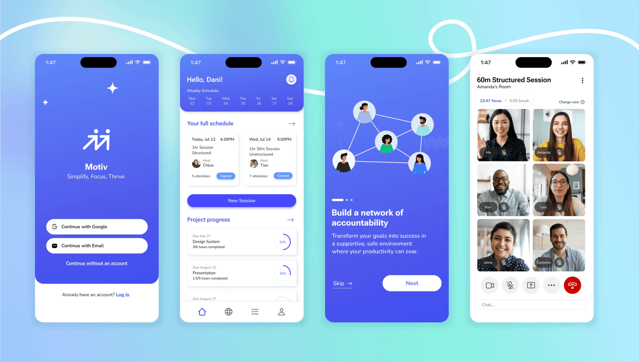
Motiv
View Prototype
A productivity app that encourages users to beat procrastination and improve focus through collaborative effort.
Responsive platform
Product Design
Mobile
User Research

Background
Staying focused on tasks and keeping yourself accountable are challenges that everyone faces at some point. Particularly for those who work or study remotely, it can be a challenge to structure your days and stick to a productive schedule.
For both students and working professionals who have trouble getting motivated or keeping focus maintaining productivity can start to feel frustrating if not impossible sometimes.
Design Goal
Create a digital co-working platform that would encourage users to increase their productivity by working virtually with others. Through building accountability and providing a space for users to focus on their work, individuals who need the extra motivation and structure would be able to accomplish their goals with more success and satisfaction.
Research Questions
What are some common struggles people have related to lack of motivation and issues focusing on their tasks?
How do people currently boost their productivity, and where do they derive motivation from?
User research
I conducted interviews with 6 professionals and students with experience working or studying remotely to understand the environment of working remotely.
Getting to know the users...
Additionally, I recruited a mix of procrastinators and non-procrastinators, to better understand any similarities or unique differences in behaviors and mindsets between individuals.
Key Findings
People were motivated by 2 main factors — external stressors (such as deadlines), and a sense of personal accomplishment.
Participants like working or studying with others for accountability reasons, and found it encouraging and easier to stay focused when staying focused with others.
Affinity Mapping
I did some affinity mapping to surface and make note of recurring patterns, noting pain points that continued cropping up and getting a sense of what motivates people to get on track with tasks.
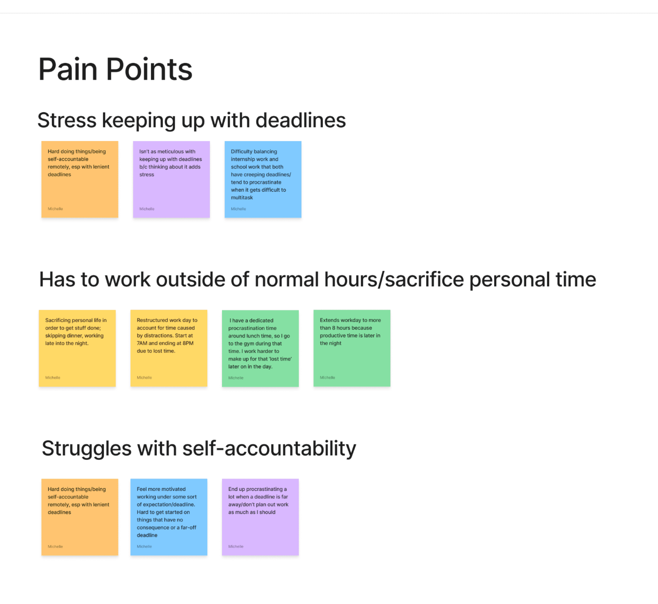
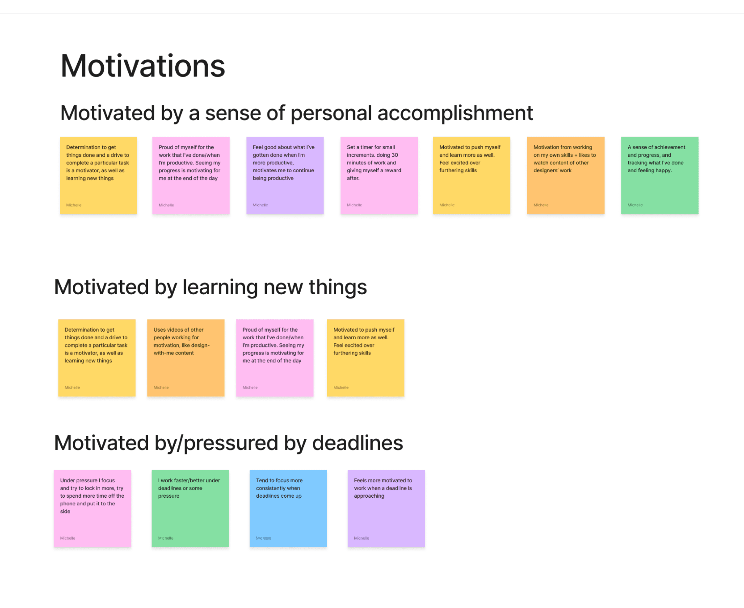
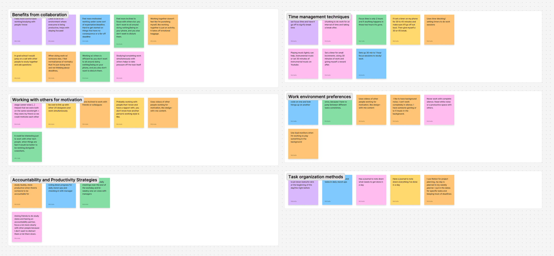
I also made note of common patterns and behaviors that could later help in ideating on potential solutions.
Analyzing competitors...
to see what current users value and dislike, and compare how they align with my own findings from my user interviews.

Studyverse
Virtual study rooms for anyone to join at any time
Users can create custom focus periods
Statistics allows users to track how much time they spend studying

Focusmate
On a team plan, teams can set up study rooms for their members
Limited to only 3 sessions per week on the free plan
No exclusive matching; users are randomly paired to work together

Study Together
Platform runs via Discord; requires users to be familiar with Discord
Users can set up self-study rooms to work on their own
Ability to create and set goals

Discord
Users have a large amount of freedom in customizing their private channels
Can be difficult to moderate/based on how moderators enforce rules
Primary purpose and function are more conducive to leisure activities
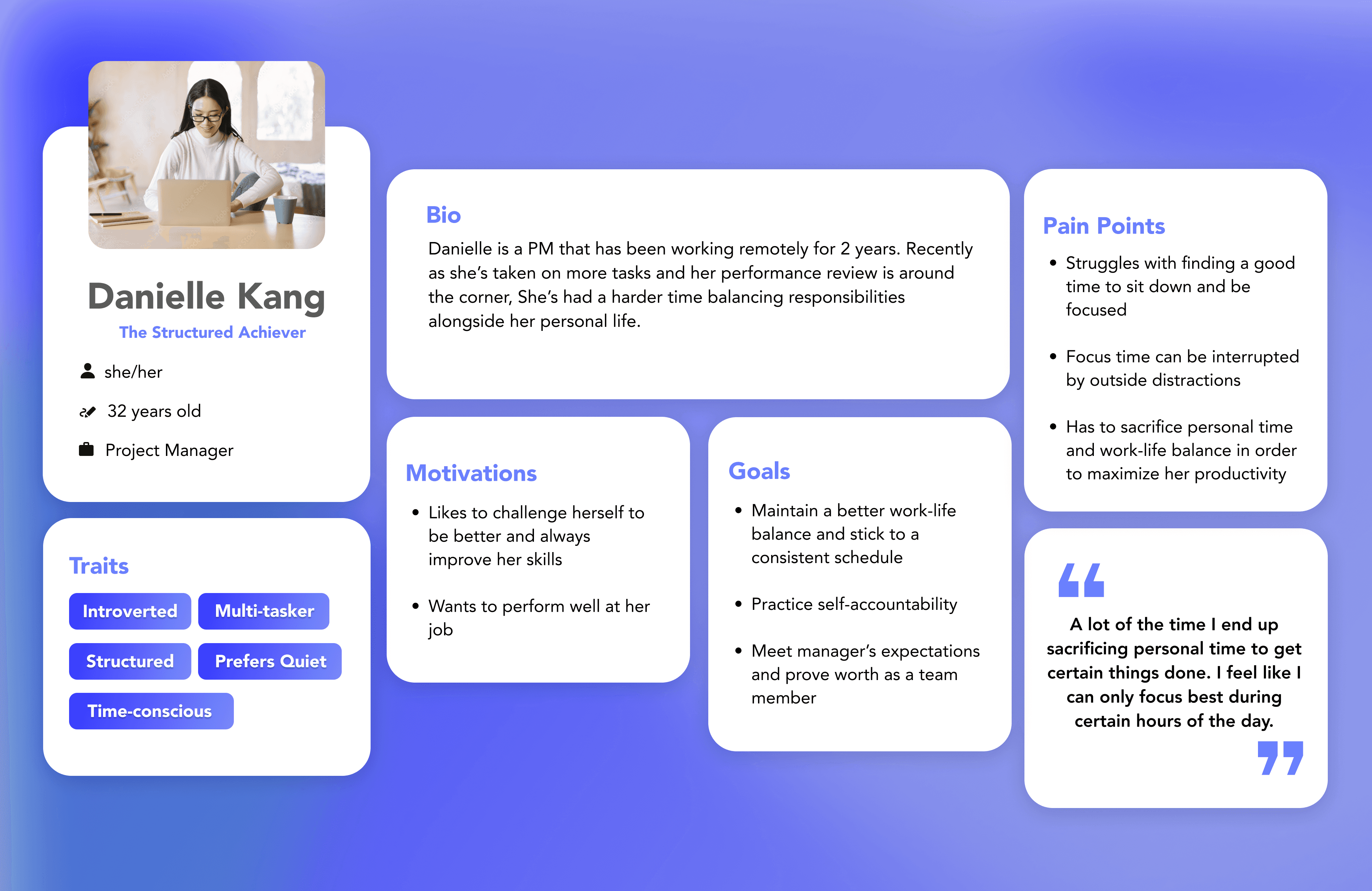
Personas
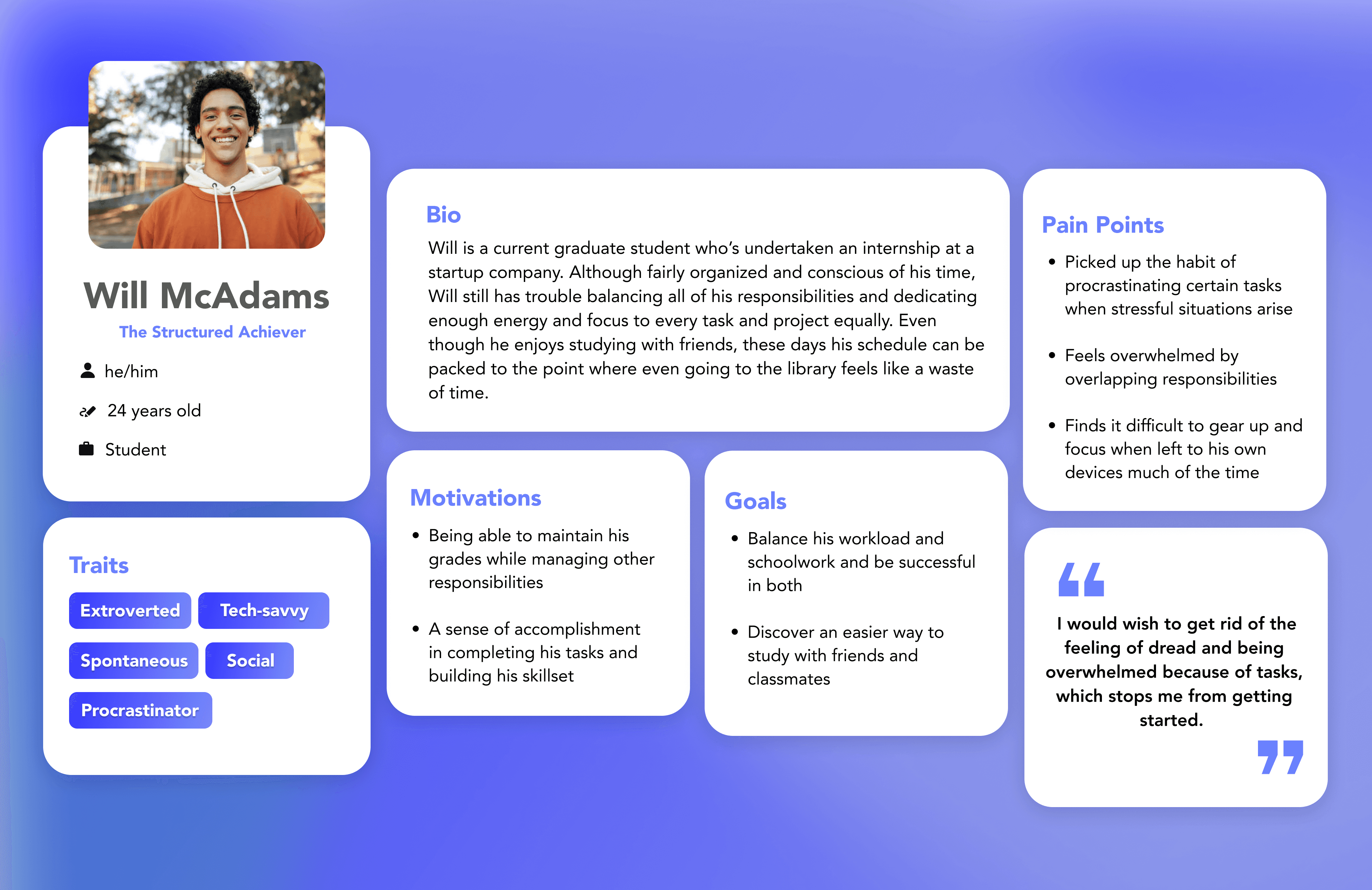
Thinking from potential users’ point of view.
Based on my research insights, I created two personas representing how potential users of this app would think and act. I consolidated the patterns I found between different people during interviewing and came up with two main archetypes.

Problem Solving
How might we foster an environment that’s conducive to focus and getting into a flow state?
How might we alleviate the stress and burden around tasks and overwhelming projects?
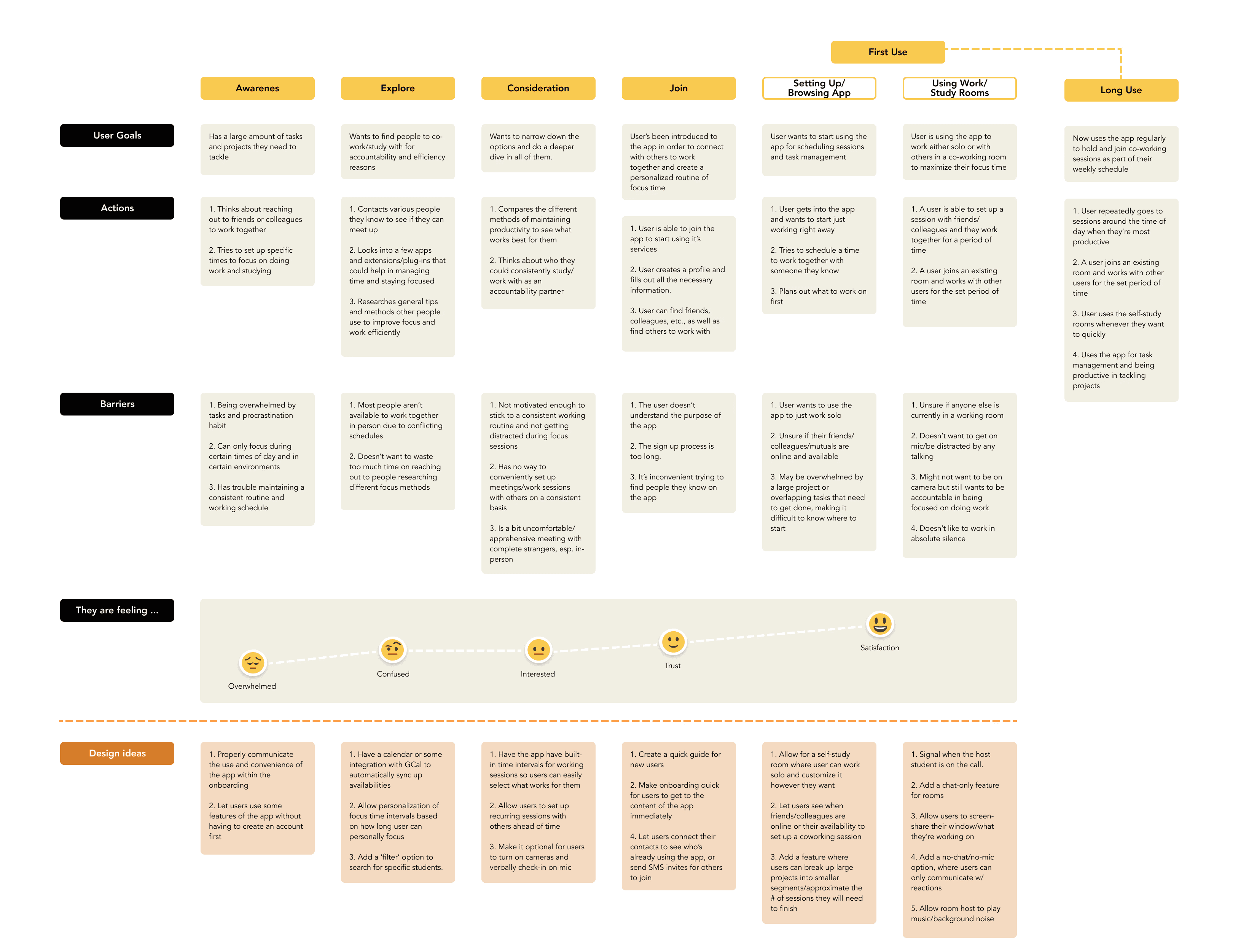
Journey Map
I created a journey map to help bridge the gap between my user research findings and the ideation process. Walking through the discovery and first-time use of the product helped me in thinking of user-centered solutions that address my personas’ pain points and goals, and narrow down possible points of opportunity/delight.
Mindmapping
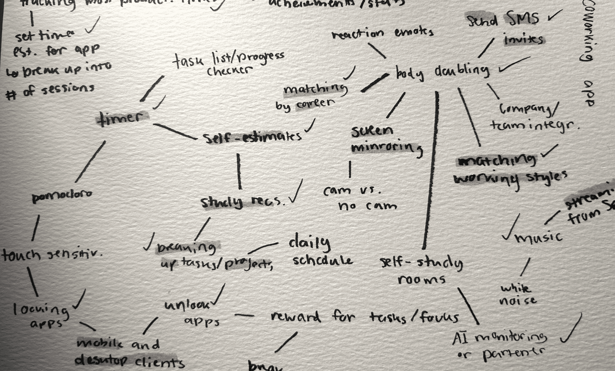
I created a quick mindmap to visualize my ideas, starting with potential features most related to my personas’ needs and pain points and branching out into related thoughts and solutions.
Sitemap and Task Flows
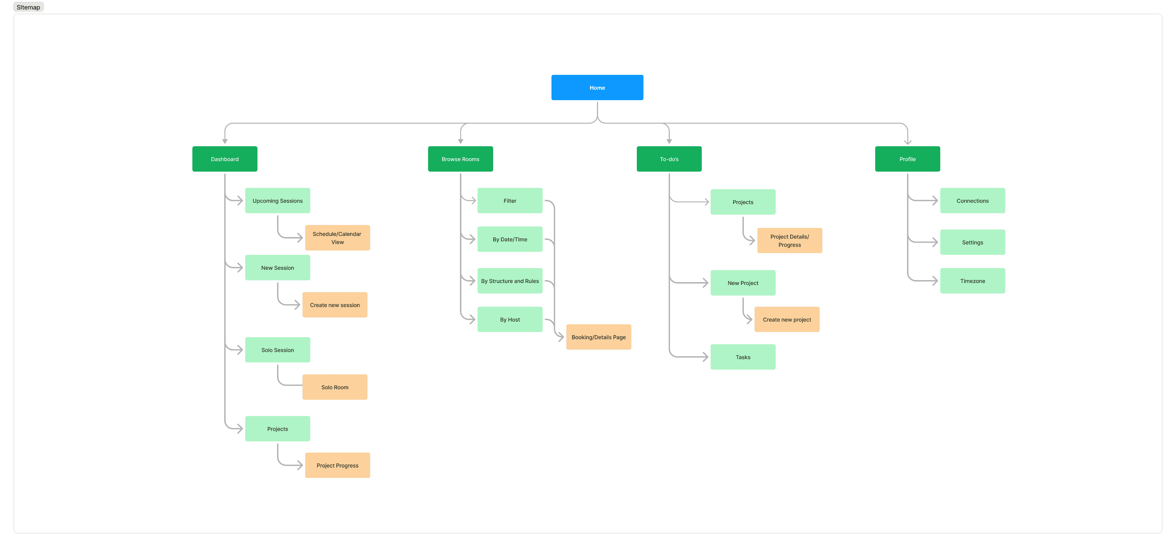
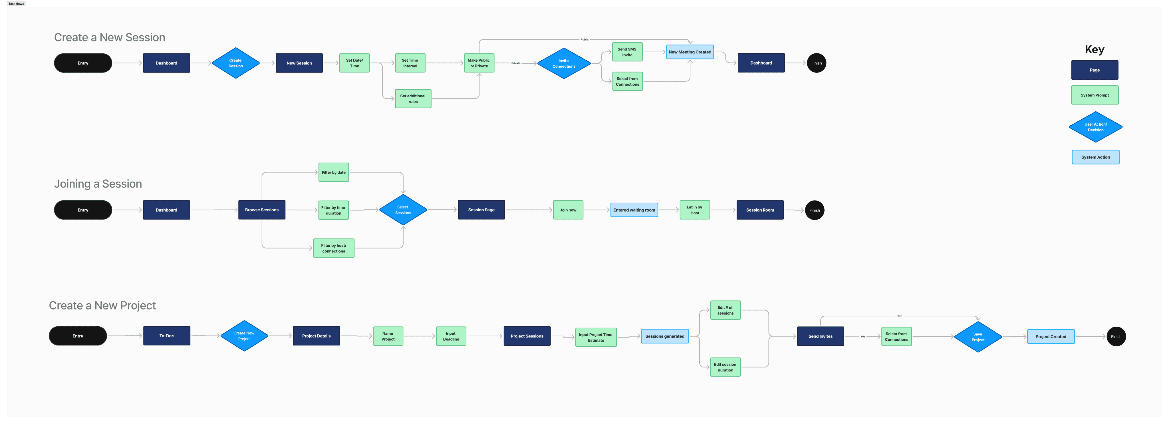
After narrowing down a feature set I then created a sitemap to lay out how features would be mapped across the architecture of the app. I wanted to get a sense of what could be the most intuitive and convenient way a user would access each feature.
For my task flows, I fleshed out the most core features of the app in order to properly lay out the step-by-step process users would need to go through to reach their goals.
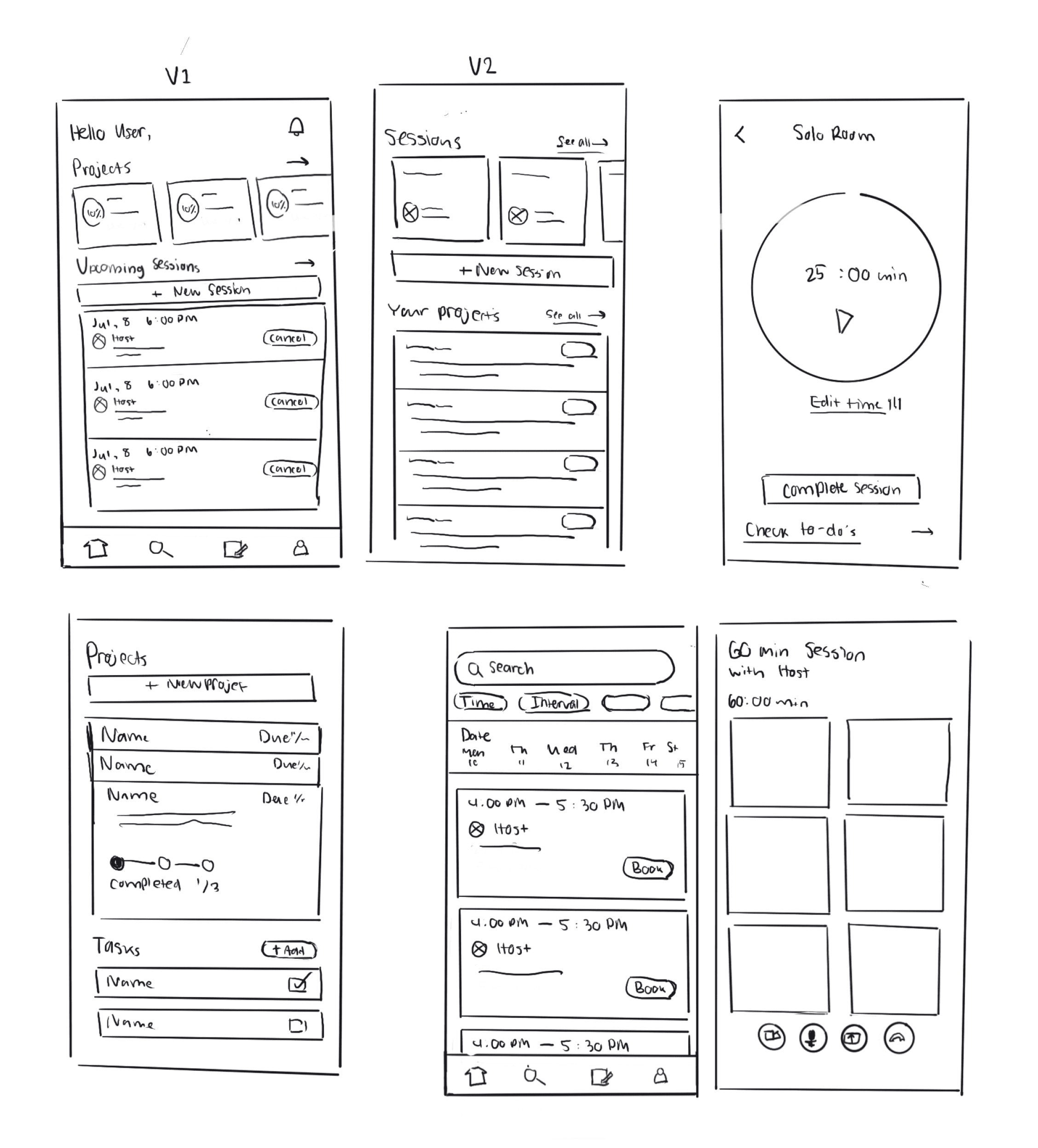
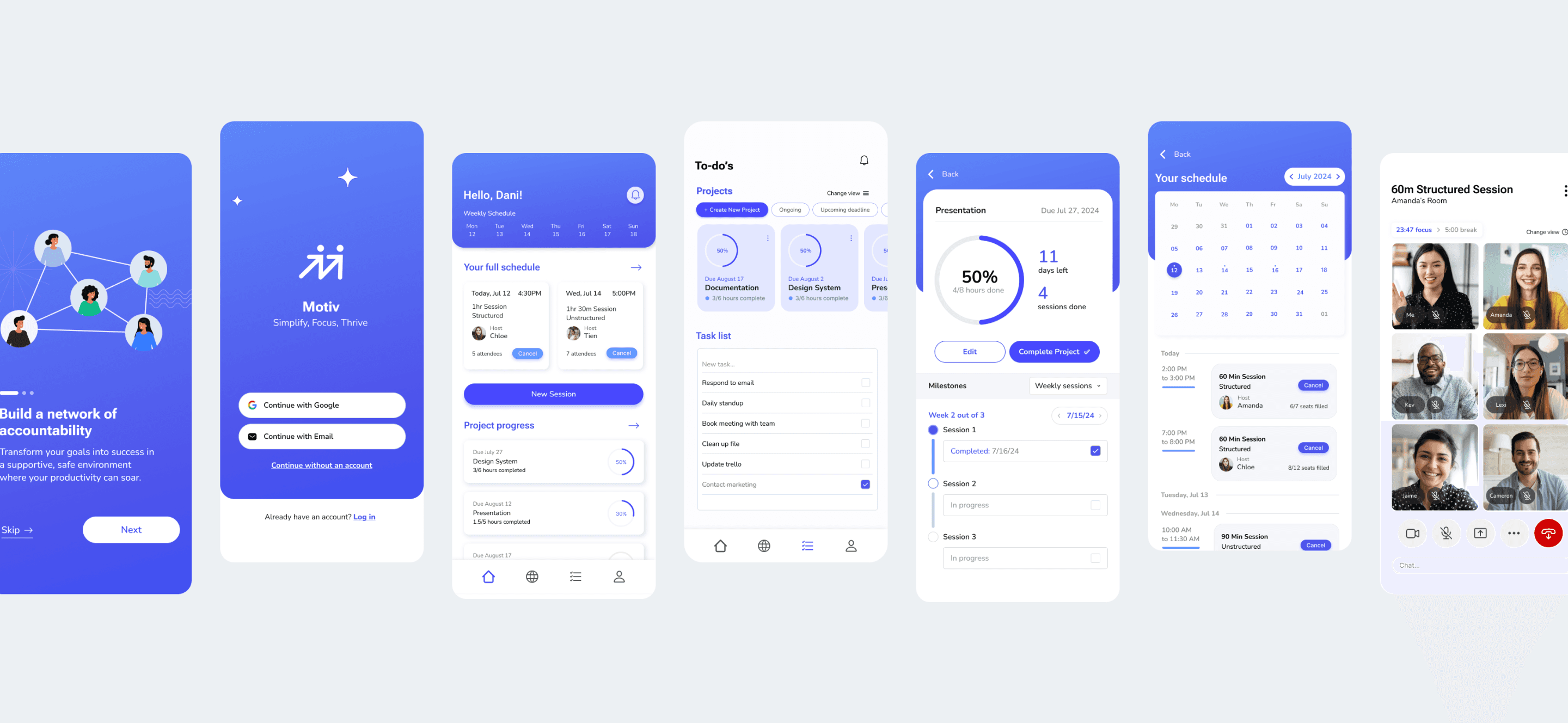
Dashboard: User’s projects and upcoming sessions take precedent first thing they see when logging in.
Solo Session Room: Minimal interface as to not serve as a distraction, rather a tool to keep focused.
To-do’s: Users can tap project card and see immediate relevant details (due date, percent completed, description, sessions). To-do list added for shorter tasks that can just be marked off.
Explore: Users can filter sessions by category and date. Available sessions displayed in chronological order by time of day.
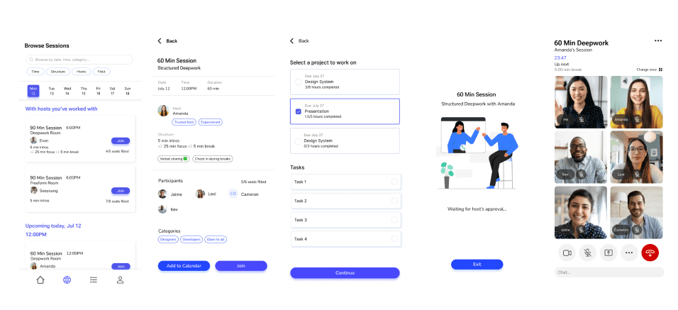
Session Room: Meeting room where users can join a public session; have the ability to mute, turn cameras off, present/share screen. Users can view how much time is left in the session.
Low-fidelity Frames
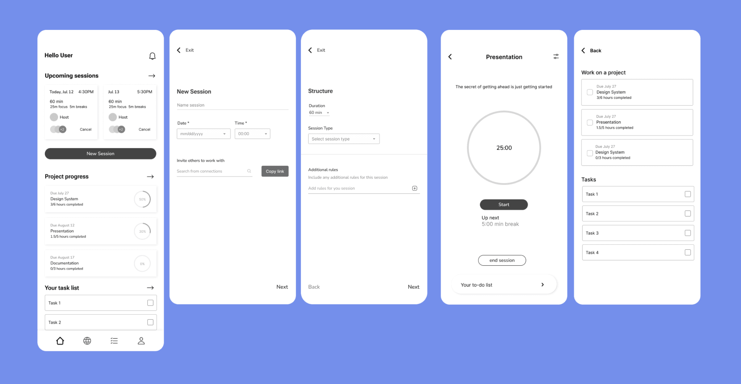
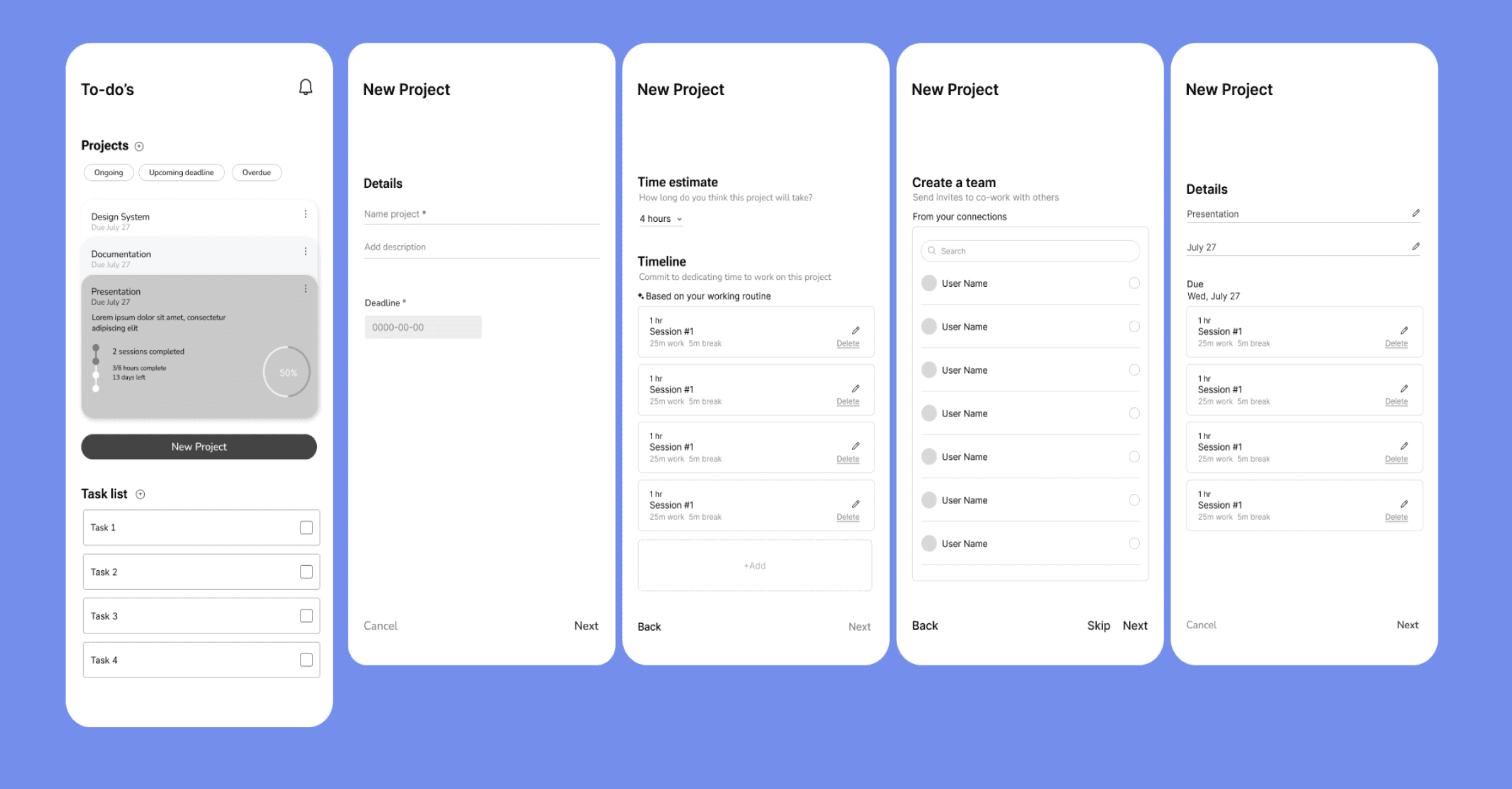
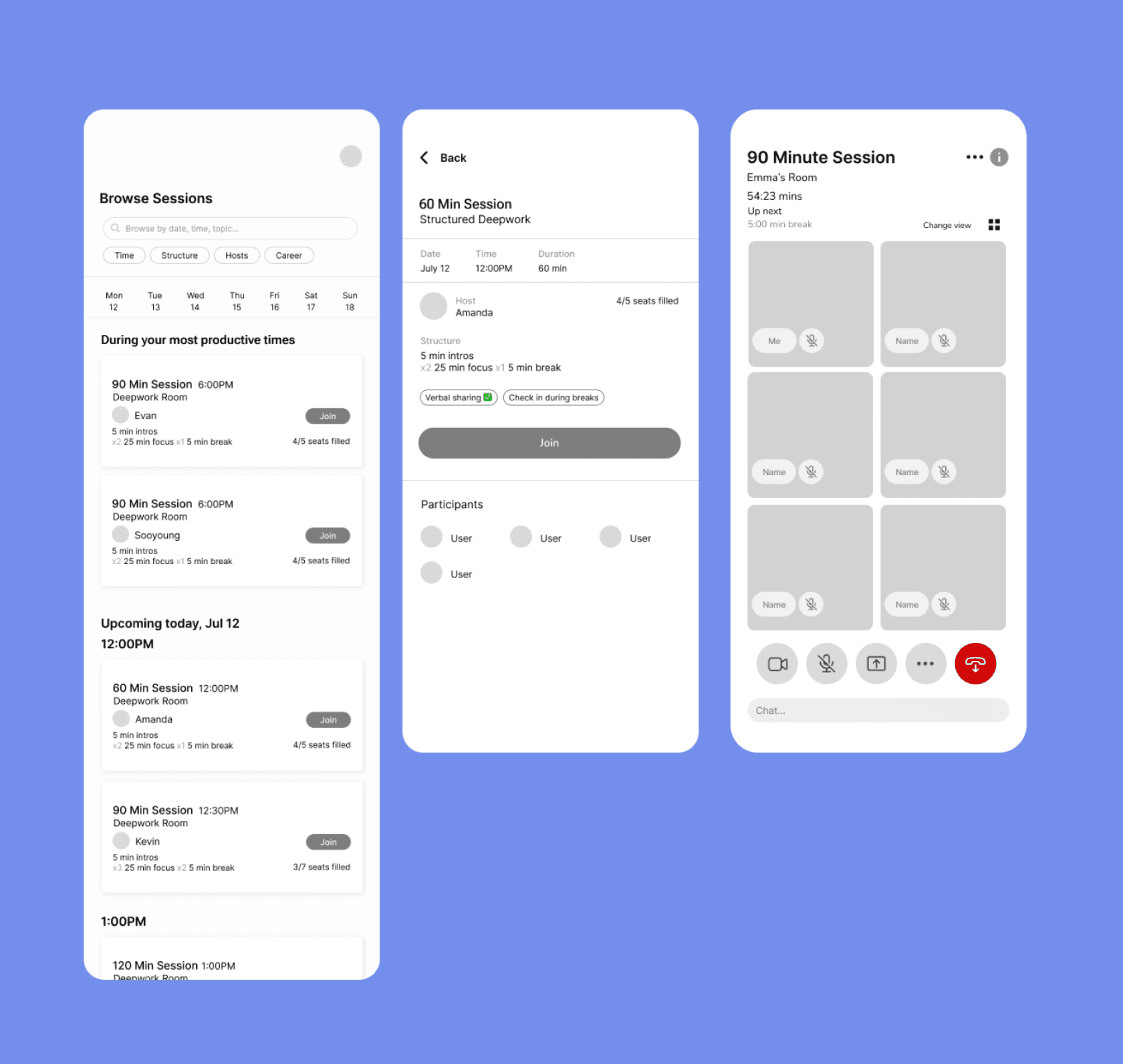
After settling on the direction of my wireframes, I moved on to fleshing out mid-fidelity mockups.to prepare for usability testing on my task flows.
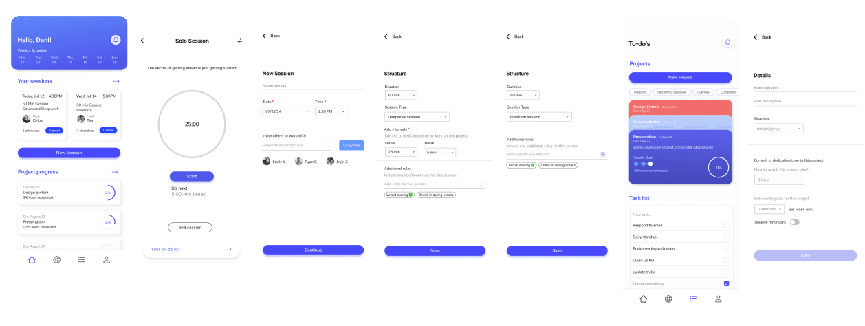
Starting a Solo Session
New Project
Joining a Session
Sign Up

Branding
Minimal
Focus-driven — a minimalist look and feel to minimize distractions.
Motivating
Splashes of color and illustrations to give an encouraging feel.
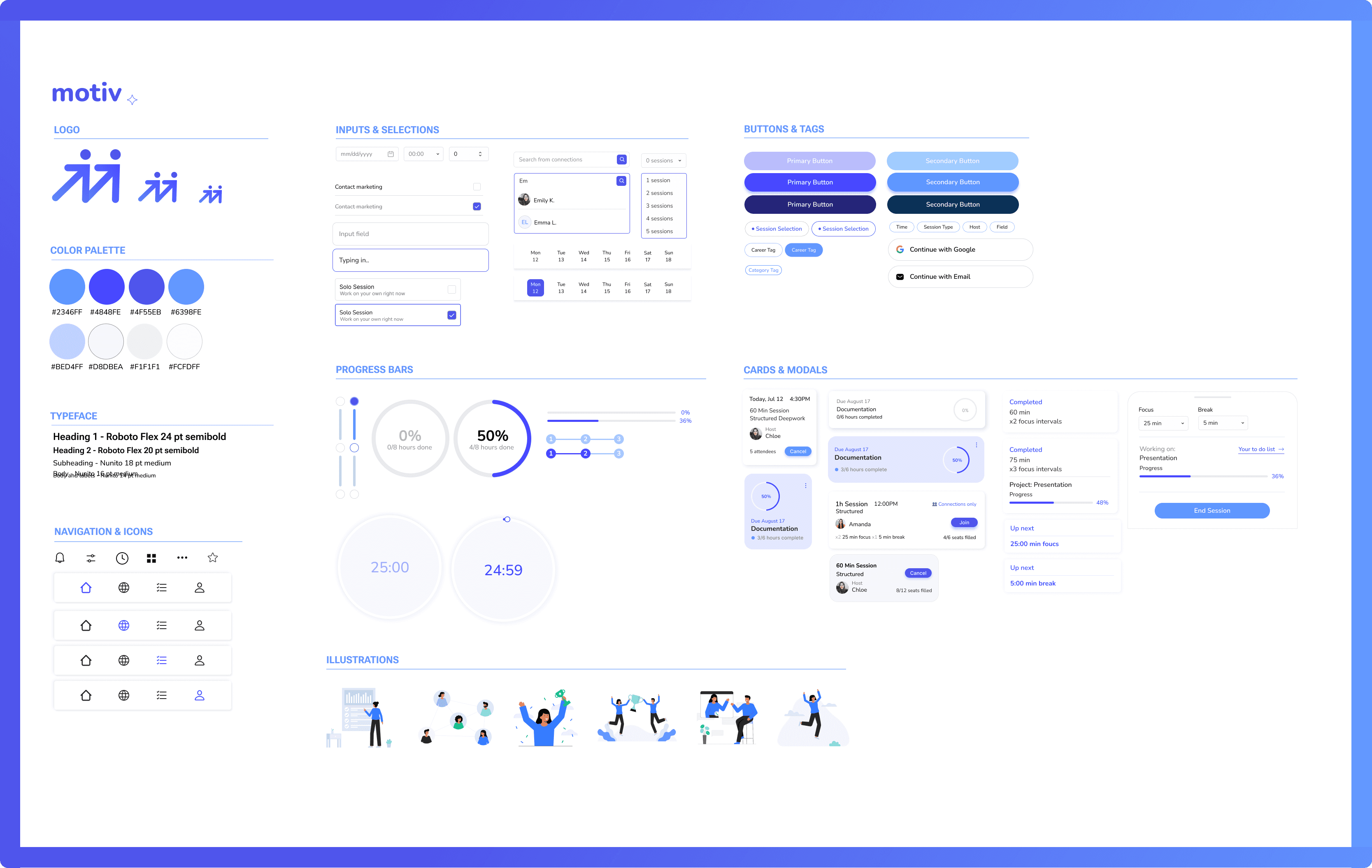
Developing a Design System
I went with using blue and purple as the primary colors to utilize.
Where blue coveys the feeling of calm and can promote the focus needed to enter a flow state, purple feels slightly more stimulating as a mixture of blue and red, and can help promote creative energy and imaginative thinking.
High Fidelity Frames
Usability Testing
I conducted 5 moderated tests with users to evaluate the intuitiveness and usability of each task flow, and to receive feedback on the overall interface of the app.
Tasks
Sign up for a new account
Join a session
Start a solo session
Create a new session
Create a new project
Testing Feedback
I discovered that majority of friction occurred when users were trying to create new projects and new sessions, so I gave those two task flows a revamp based on feedback.
Additionally, I made iterations based on difficulties users faced with legibility and lack of clarity regarding certain UI.
BEFORE
AFTER
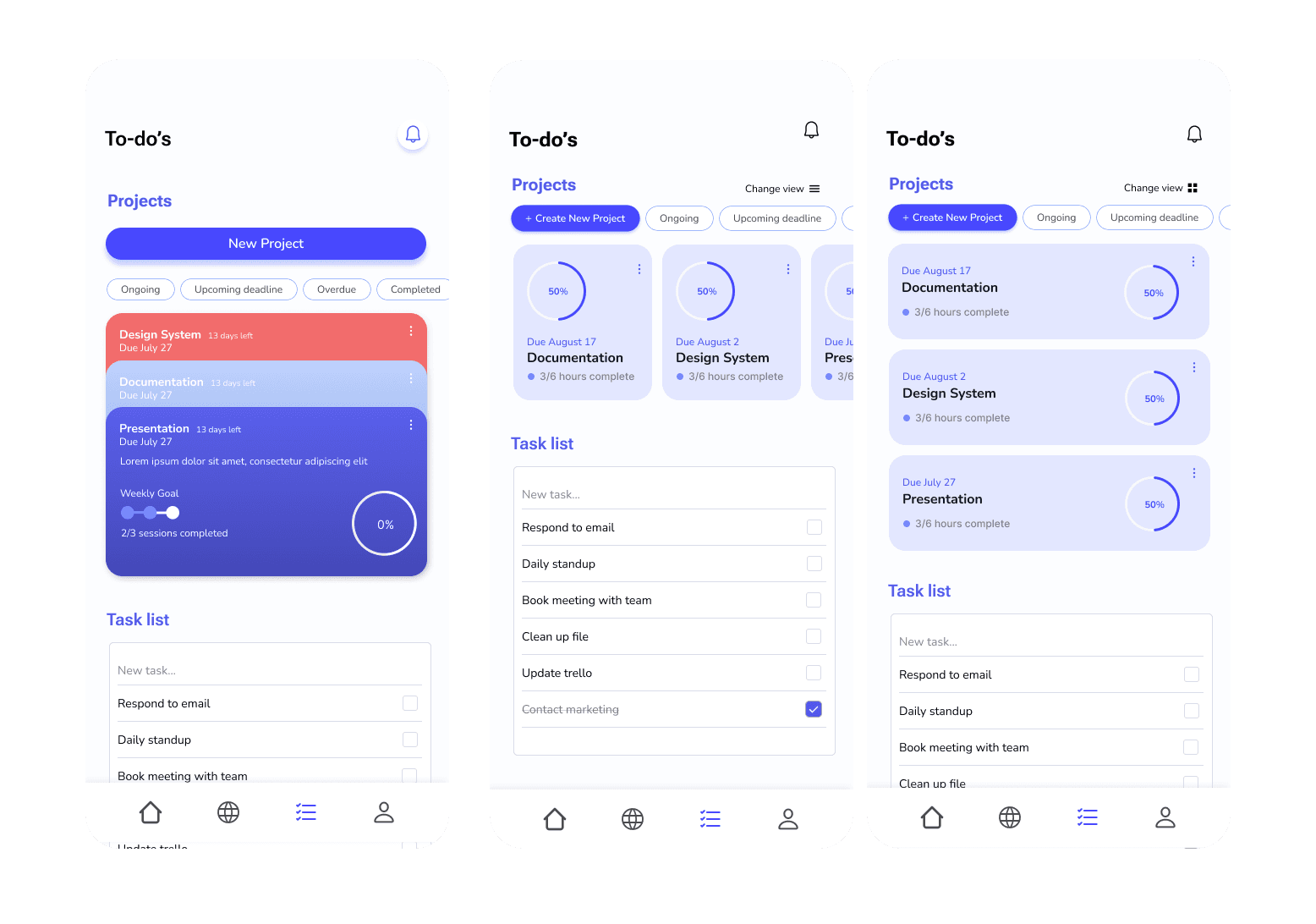
To-do screen
Changed the look of project cards to allow for more quick readability and better accounting for users who create large numbers of projects.
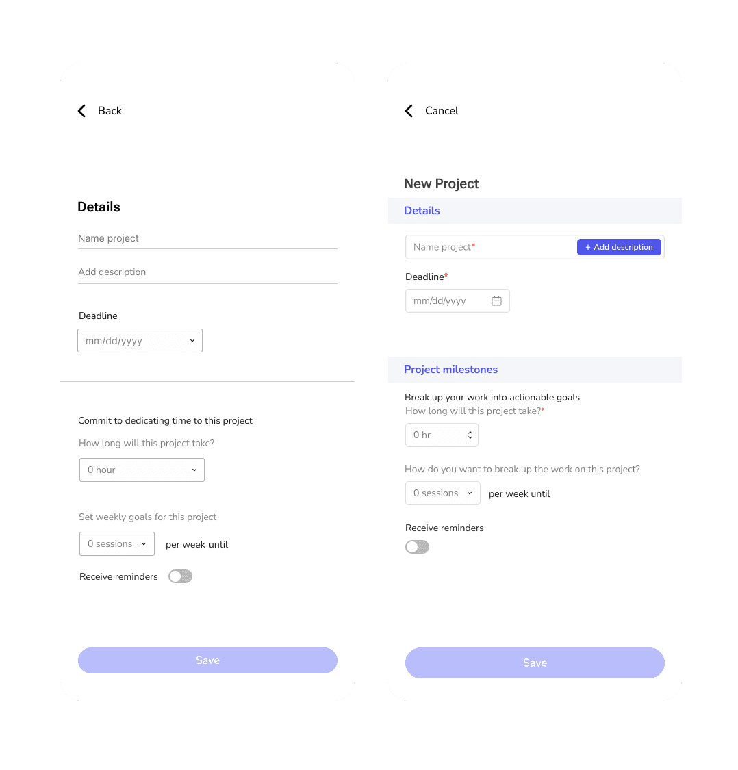
Create a new project
“New project” has been revamped with more clear categorization and UX writing so users can easily understand how progress tracking will work.
BEFORE
AFTER
BEFORE
AFTER
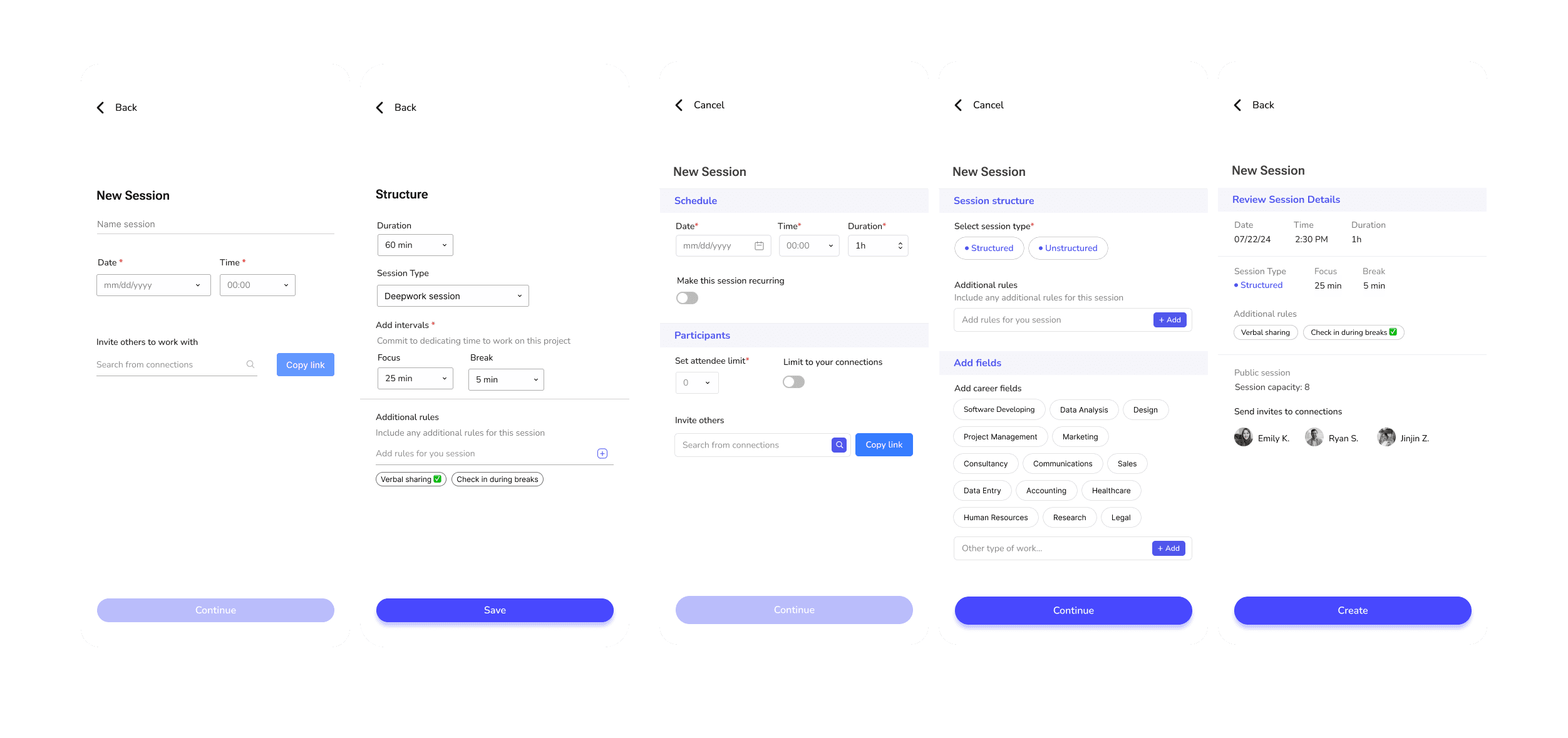
Create a new session
Altered UX writing from “freeform session” to “structured session” for clarity.
Made input fields more apparent to users.
Added a way for users to limit group sessions to be visible to connections-only.
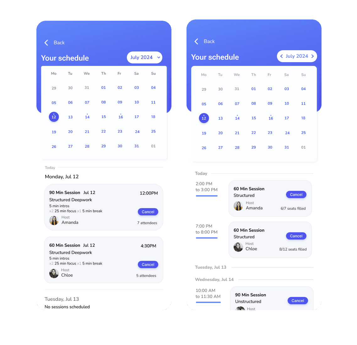
Calendar view
Altered calendar for better readability by time and date.
BEFORE
AFTER
BEFORE
AFTER

Joining sessions
Adjusted background color to make session cards easier to view.
Altered filter tags to easier toggle between different session types.
Sessions that are between your connections only.
Added end-of-session achievements as a motivational tool.
BEFORE
AFTER
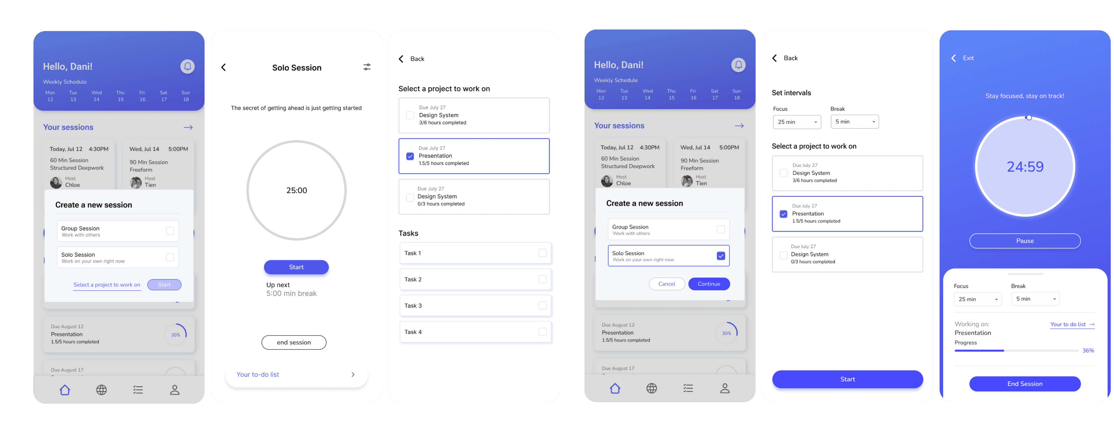
Solo session
Altered flow so users have the choice to select a project to work on before starting a new session.
Making it more clear for users on how to adjust focus and break intervals
Final Results


Sign Up
Input details to better personalize your experience using the app.
Join Sessions
Virtually meet with others who share the goal of maximizing your focus time and productivity.


Plan out Projects
Don’t let procrastination win — split up large tasks into manageable chunks you can knock out session-by-session.
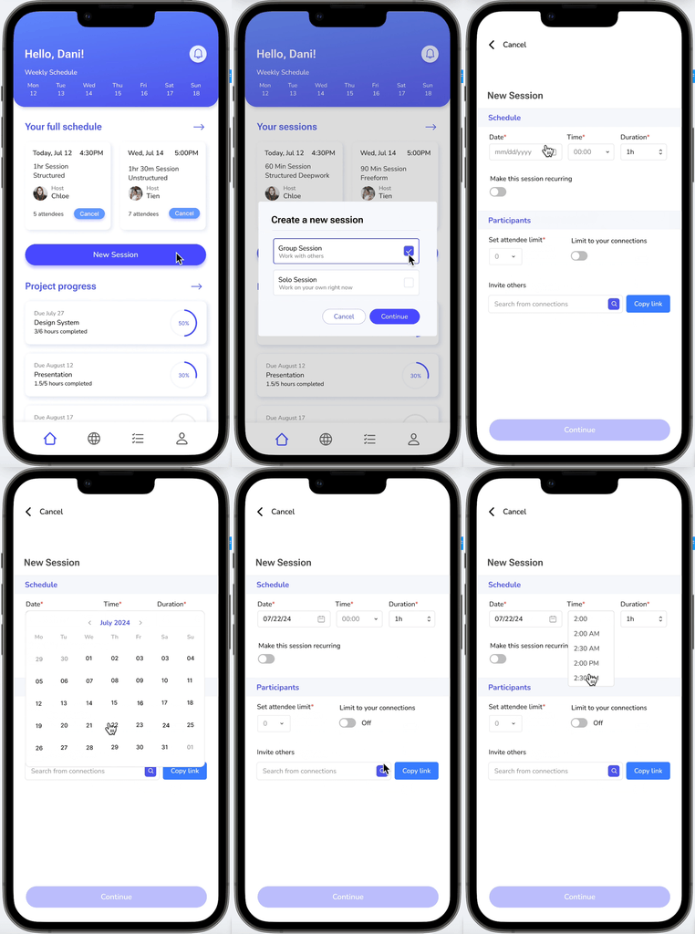
Create Sessions
Host your own sessions and invite others to join you.


Do your own thing.
Set aside distractions and get to work on your own — anytime and anywhere.
Reflection
Thinking back on my design process, I realize how essential testing and iteration are for creating a seamless user experience. Considering user needs at every step of the process and asking the right questions during the testing stages provides valuable insights that aid in moving forward the appropriate design choices and solutions.
Looking back, ideally I would have conducted a survey to gather a larger sample of results to better gauge users' current methods and preferences on how they typically keep progress of large tasks and projects in order to provide more clarity to my iterations. I also would have probably conducted some initial quick A/B testing to receive feedback on which UI choices felt more intuitive and resonant with users.
Impact and Future Steps
I’d like to develop the platform for desktop, as some users expressed interest in a desktop version of the app. For now I’ve kept Motiv at the mobile stage for convenience and portability, and to limit distractions while working on a computer to avoid toggling back and forth between windows. However, in the future the natural course seems to lean towards building out a version for desktop, especially for those who prefer not dealing with their phones at all while working.
Additionally, based on the number of individuals using Motiv to work together with team members, it could be a future possibility to introduce a team plan where users can not only meet synchronously with team members but share projects and tasks with one another.

Read other case studies!

